Reference for every block type available in the Document View editor: text, field value, file, image, table, summary, page break, and container.

Josh Puppe
Document View Blocks
The Document View editor builds reports out of blocks. Each block displays one piece of content. This article is the reference for all available block types and the settings each one supports.
For the editor concepts that surround blocks (frames, containers, edit modes), see Document View Editor.
Block palette groups
Blocks are organized into groups in the editor palette. Each group is color-coded:
Group | Color | Purpose |
|---|---|---|
Static | Green | Fixed content that is the same on every page |
Element | Yellow | Built-in element data and metadata |
Field | Blue | Dynamic values from the element's own fields |
Layout | Gray | Containers and column structures |
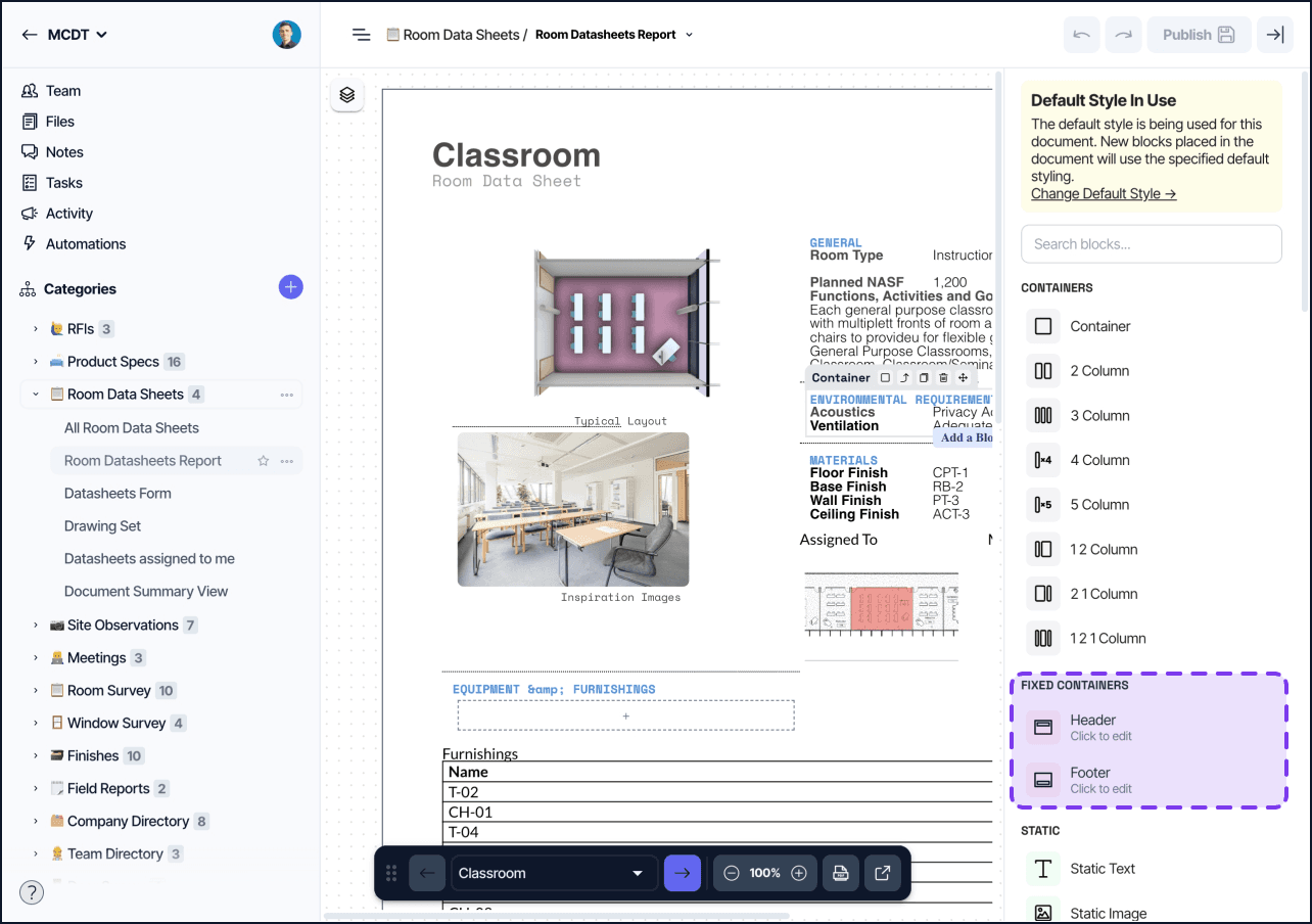
Fixed | Red | Header and footer that repeat on every page |
Summary | Purple | Multi-element blocks (Summary mode only) |
Adding and removing blocks
To add a block, enter edit mode and drag it from the block palette into the document. Drop it inside a container or directly onto the page. Blocks dropped directly onto the page are wrapped in an implicit container.
To remove a block, select it and press Delete, or use the block context menu.
To reorder blocks, drag them above or below their siblings. Drag a block out of one container into another to reparent it.
Block settings panel
Selecting a block opens its settings panel on the right side. The panel shows the block type at the top, followed by configurable options. Settings save automatically as you change them. Click Publish to make changes visible to other users.
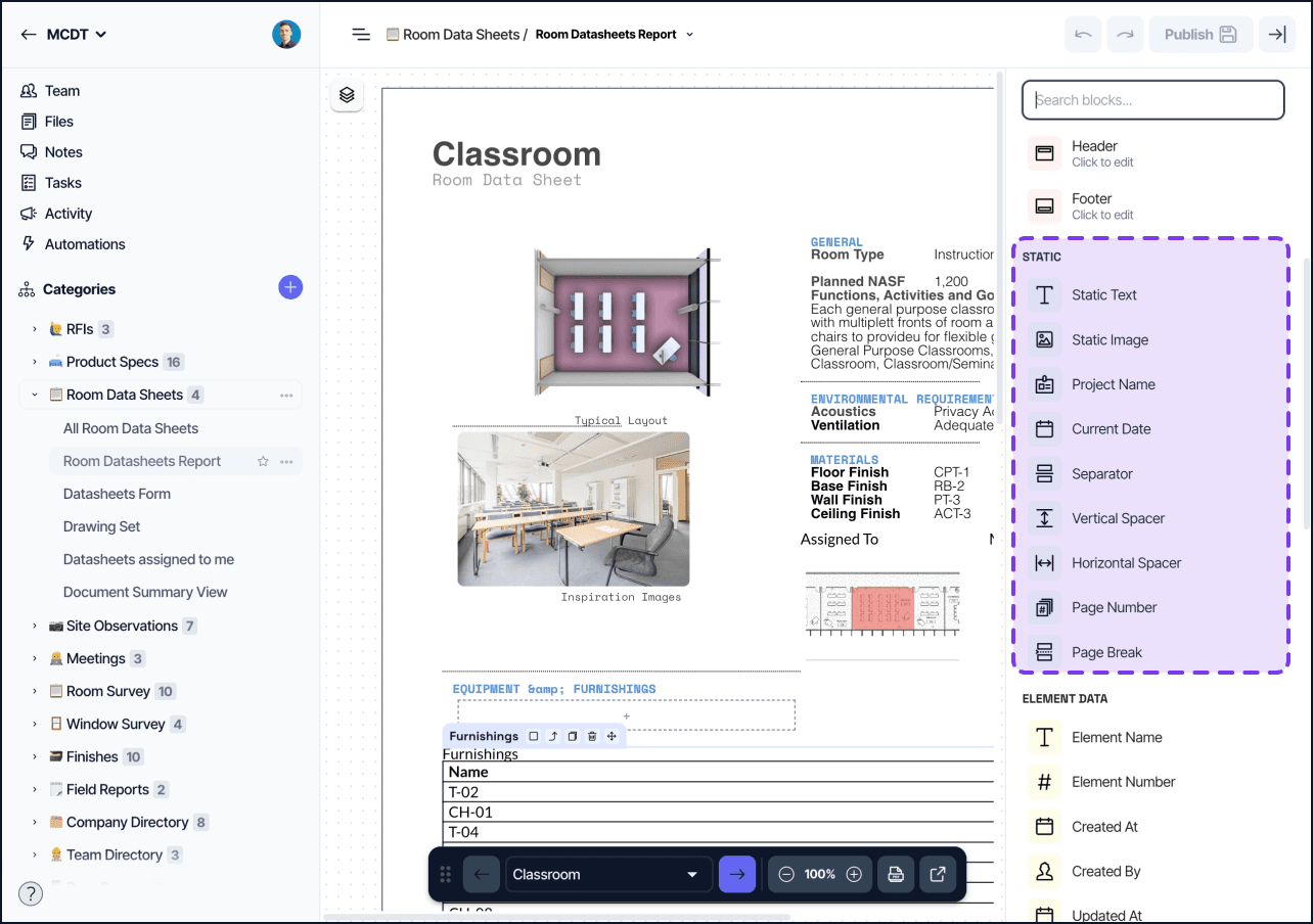
Static blocks
Static Text
Renders fixed, editable text in the document. Use it for headings, instructions, captions, and any copy that is the same on every page.
Settings:
Text content (rich text with bold, italic, underline, lists, links)
Font, size, color, background color
Alignment (left, center, right, justify)
Padding, width
Static Image
Displays a fixed image uploaded directly to the block or referenced by URL. The image is not tied to any element data.
Settings:
File upload or URL
Alignment
Dimensions (width, height)
Lock aspect ratio
Project Name
Renders the project name dynamically. Use it in headers, footers, or cover pages so the block updates automatically if the project is renamed.
No configurable settings beyond styling.
Current Date
Renders the date at the time the document is exported or printed. The date is not stored; it always reflects when the output was generated.
No configurable settings beyond styling.
Separator
Renders a horizontal rule for visual dividing lines between sections.
Settings:
Height and width (%)
Alignment
Line style (Solid, Dotted, Dashed, Double, Groove, Ridge)
Color
Padding
Vertical Spacer
Inserts vertical whitespace between blocks. Use it to control spacing without adjusting container padding.
Horizontal Spacer
Inserts horizontal whitespace inside a row container. Use it to push blocks apart within a column layout.
Page Number
Renders the current page number. Only visible in the exported PDF; the block shows a placeholder in the editor.
Settings:
Format (Page number only / Include total as
[#] of [#]/ Include total as[#]/[#])Reset after Element — restarts numbering for each element (useful in Single Element mode)
Text style (font, size, color)
Page Break
Forces the next block onto a new page. Use page breaks to control where pages end on multi-page records.
No configurable settings.
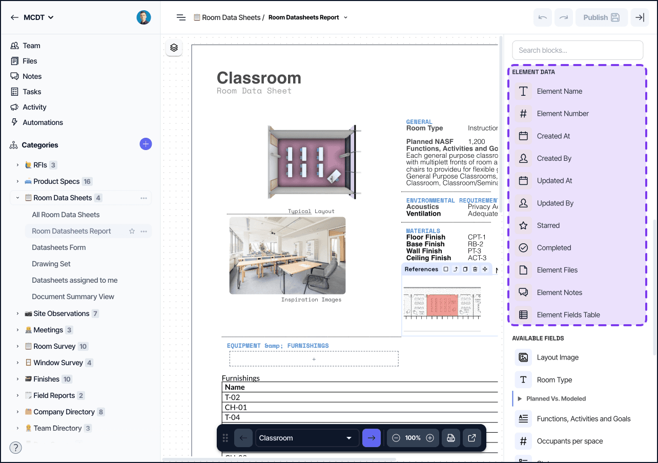
Element blocks
These blocks display built-in element data that exists on every element regardless of category.
Element Name / Element Number
Renders the element's display name or its auto-increment number. Both use the same text field settings.
System fields
Created At, Updated At, Created By, Updated By, Starred, and Completed render the corresponding system-level metadata for the element. Each uses the settings appropriate to its data type (date, user, or boolean).
Element Files
Renders all files attached to the element (across all file fields). Useful for a consolidated attachments section.
Settings:
Display mode (Grid or List)
Thumbnail size
Click-through behavior (open the original file)
Element Notes
Renders the notes thread for the element.
Settings:
Text style
Show author
Show note date
Show associated field name
Element Fields Table
Renders all visible fields for the element in a two-column label/value table layout. Useful as a compact property sheet without manually placing individual field blocks.
Settings:
Fields to display (reorderable, selectable)
Per-field custom display name
Per-field label cell style override
Per-field value cell style override
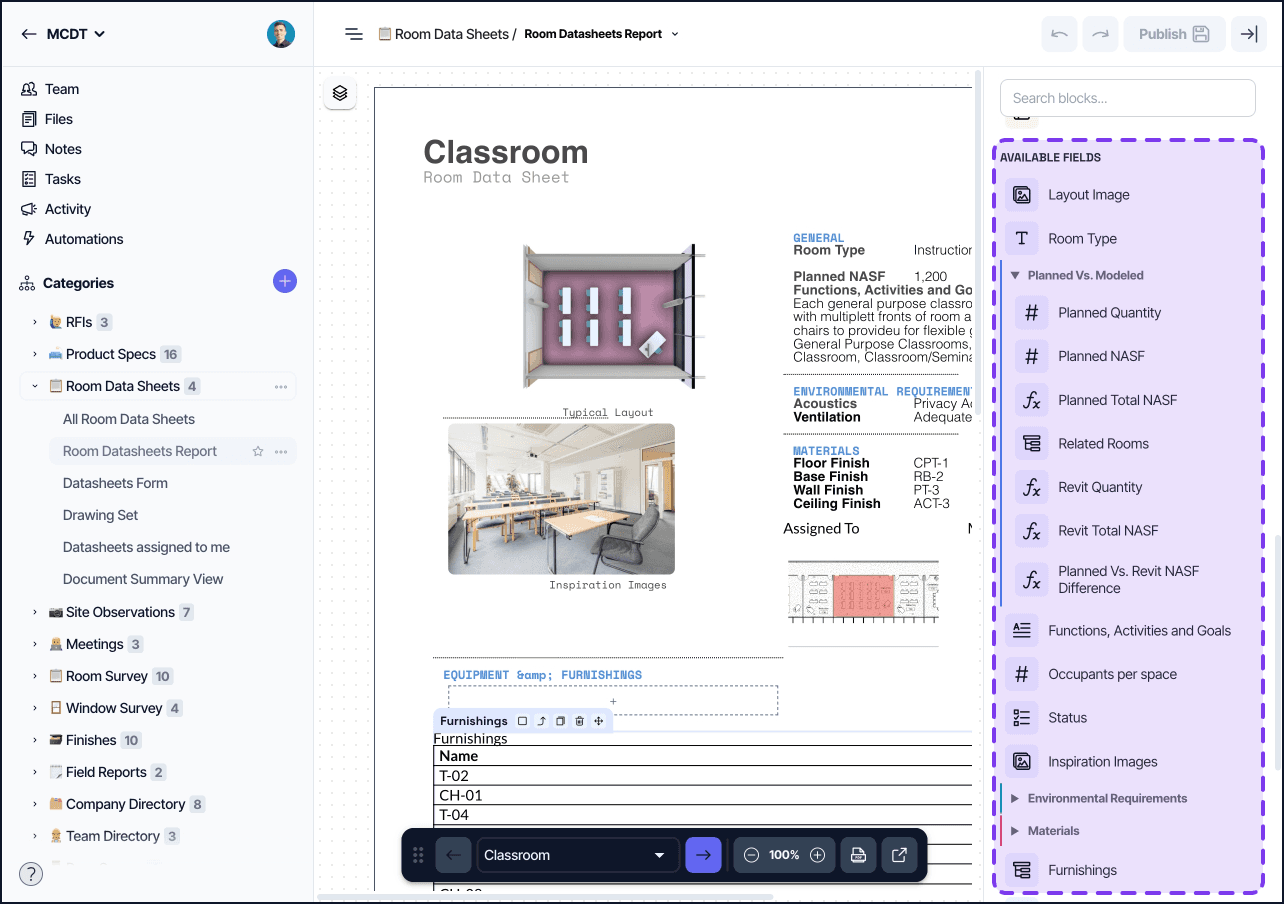
Field blocks
Field blocks are added from the element's field palette. One block type exists for each field type (Text, Number, Select, Date, Person, Files, Formula, Related Elements, References, Lookup, Revit Parameters, etc.). All field blocks share a common base and then add type-specific settings.
Common settings on all field blocks:
Field selector (which field to display)
Show Field Name (toggle label visibility)
Label override (custom label text)
Label position (Beside or Above)
Conditional formatting, see Conditional Formatting
Conditional visibility, see Document View conditional visibility
Related Elements field — this field type has an additional display mode setting:
Mode: Table, List, or Inline
In Table mode: visible columns, column sorting, Show Table Header, column aggregations (Sum, Average, Count)
In List mode: Link to related element (optionally targeting a specific view)
Files field — renders files from a single file-type field:
Display mode (Grid or List)
Thumbnail size
Click-through behavior
Layout blocks
Container
Groups other blocks into a single layout region. Containers can be nested.
Settings:
Layout direction (row or column)
Padding, margin, alignment
Width
Conditional visibility, see Document View conditional visibility
Column layouts
The palette provides column layout shortcuts: 2 Column, 3 Column, 4 Column, 5 Column, and common proportional variants (1:2, 2:1, 1:2:1). These are pre-configured Containers, they share the same settings and can be adjusted freely after placement.
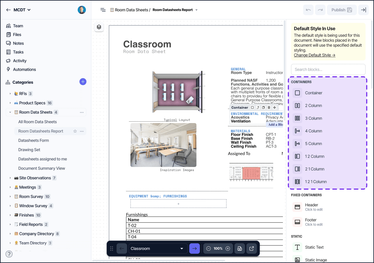
Fixed blocks
Fixed blocks anchor to the top or bottom of every page and can only be added once.
Header
A canvas that repeats at the top of every page. Typically used for logos, project name, and document title.
Settings:
Height
Container layout and styling (conditional visibility is not available)
Footer
A canvas that repeats at the bottom of every page. Typically used for page numbers, dates, and legal copy.
Settings:
Height
Container layout and styling (conditional visibility is not available)
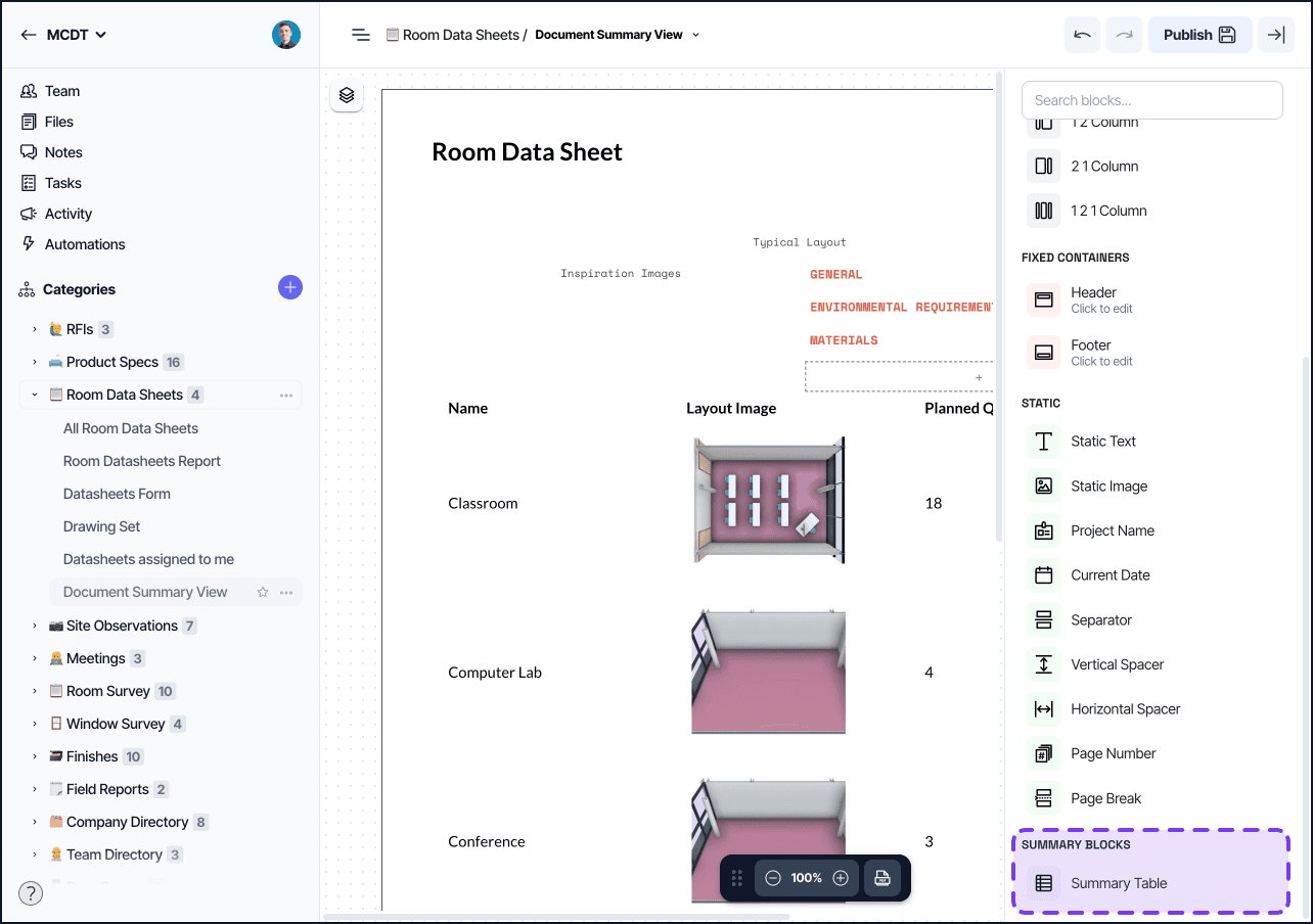
Summary blocks
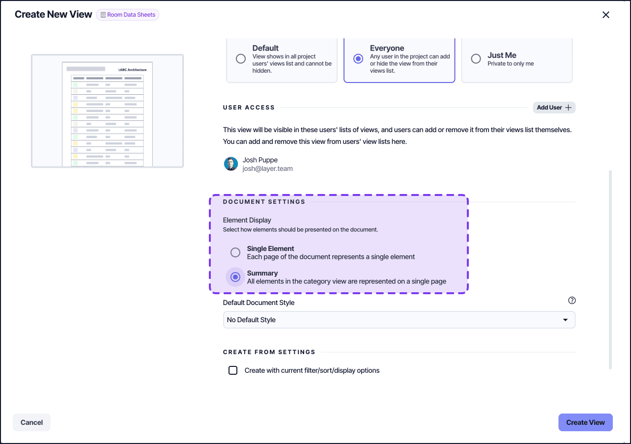
These blocks are only available when the Document View's Elements Mode is set to Summary. See Document View Settings.
Summary Table
Lists every element in the category across rows with one column per visible field. The view's filters and sorts apply to the table.
Settings:
Filtering configuration
Sorting configuration
Visible fields (reorderable)
Column aggregations (Sum, Average, Count)
Per-column summary labels
Tips
Apply conditional visibility to a Container to show or hide every block inside it at once with a single condition.
Field value blocks update live as the underlying element changes — no need to refresh the document.
The Related Elements field block and the Summary Table block both support column aggregations, but their scope differs: Related Elements aggregates across one element's relationship rows; Summary Table aggregates across all elements in the category.
Page Number and Current Date only render their real values in the exported PDF; they display as placeholders in the editor.
Header and Footer cannot have conditional visibility set on them directly — apply visibility logic inside them using a nested Container.